") Türkiye (Türkçe)
Türkiye (Türkçe)") Worldwide (English)
Worldwide (English) 0850 780 4800
 Bilgi Bankası
 Destek Sistemi
 Giriş Yap
 Hesap Oluştur
Bootstrap Class Referansı
İçindekiler
- Bootstrap Class Referansı Bootstrap v4.3.0 Class Listesi Class Name Preview Description Category .align-* A set of utility classes that are equivelant to writing the css property vertical-align:middle;You can use this on inline and table cell elements. .align-(baseline, top, middle, bottom) Utility .align-content-* Added to the parent flexbox container to determing how the elements are aligned horizontally. .align-content-(start (browser default), end, center, between, around, or stretch) Utility .align-items-* Class added to flexbox child items to specify if it should align towards the top or bottom of the container (start, end) Utility .align-self-* Used on flexbox items to align them vertically in relation to the parent container. If columns are used the items will align verticall. (start, end, center, baseline, or stretch (browser default) Utility .align-text-* A set of utility classes that are equivelant to writing the css property vertical-align:text-bottom; You can use this on inline and table cell elements. .align-text-(top, bottom) Utility .badge-* Used for labels and counters in applications .badge-(light, dark primary, secondary, transparent, white, warning, success, info, danger) Badge .bg-* Background color utility classes: .bg-(light, dark primary, secondary, transparent, white, warning, success, info, danger) Utilities .border-* A versatile border utility class that lets you add/remove borders on a side or change a border color. .border-(light, dark primary, secondary, transparent, white, warning, success, info, danger, 0, top-0, right-0, bottom-0, left-0, top, right, bottom, left) Utility .btn-outline-* A button variation to have outlined buttons instead of a solid background. .btn-outline-(light, dark primary, secondary, transparent, white, warning, success, info, danger) Buttons .carousel-control-* When you have an image carousel with pagination you will use this class on the previous and next anchor links. .carousel-control-(prev, next) Carousel .carousel-fade n/a Animates the slide transition with a crossfade instead of a slide Utility .col Flexbox items are automatically equal width so this class is used when you want your columns to be equal width and then go 100% on the xs breakpoint. Grid .col-* This class is used for grid columns to determin the column width and the breakpoint you would like it to be active. The classes work from the breakpoint you set and everything larger. .col-(sm, md, lg, xl)-(1-12) Grid .custom-range Changes the default styling of a form input range Forms .d-flex n/a Sets the element to have have the style property display:flex; Utility .d-none n/a Sets the element to have have the style property display:none; Utility .d-*-* n/a A responsive display utility class that lets you specify when a display property is applied to the element. .d-(sm, md, lg, xl)-(none, inline, inline-block, block, table, table-cell, table-row, flex, inline-flex ) Utility .d-print-* n/a Changes the display of elements when you print the document. .d-print-(flex, inline-flex, table, table-cell, table-row) Utility .fixed-* n/a This class makes an element fixed to the top/bottom of the browser window. Here is what the CSS ruleset looks like. .fixed-bottom {position: fixed;right: 0;bottom: 0;left: 0;z-index: 1030;} Utility .flex-*-*-* n/a Change the flexbox items layout, alignment, or size. .flex-(sm, md, lg, xl)-(row, row-reverse, column) Utility .flex-fill-* n/a Add to all sibling elements you would like to force into equal widths and fill all available horizontal space. .flex-fill-(sm, md, lg, xl) Utility .flex-(grow|shrink)-* n/a Forces an element to grow or shrink to use more or less of the space available .flex-(grow, shrink)-(0, 1) Utility .float-*-* n/a Responsive utility to float an element. .float-(sm, md, lg, xl)-(none, left, right) Utility .form-control-plaintext Use the .form-control-plaintext class to remove the default form field styling and preserve the correct margin and padding. Forms .form-row Works similar to a grid .row but is more compact to make the form look more uniform Forms .h-* Height utility class that makes the element a percentage height of its parent element. h-(25,50,78,100, auto) Utility .invalid-feedback This class can be added with server side form validation to add a feedback message to an invalid field Forms .is-* n/a If you do server side form validation you can use this class to set feedback colors on inputs or error message. .is-(valid, invalid) Forms .justify-content-*-* Class specifies where the flex items will be positioned inside the container. .justify-content-(sm, md, lg, xl)-(start, end, center, between, around) Utility .m*-*-* n/a Applies margin to an element using responsive breakpoints {property}{sides}-{breakpoint}-{size} m(t,b,r,l,x,y)-(sm, md, lg, xl)-(0, 1, 2, 3, 4, 5) Utility .p*-*-* n/a Applies padding to an element using responsive breakpoints {property}{sides}-{breakpoint}-{size} p(t,b,r,l,x,y)-(sm, md, lg, xl)-(0, 1, 2, 3, 4, 5) Utility .progress-bar-animated When this class is added to a progressbar the progress will be animated using css3 animations Progress .nav-fill Makes all nav items use all available horizontal space. Nav items are different widths baded on their content. Navs .nav-justified Makes all nav items equal width and use all available horizontal space. Navs .navbar-collapse n/a The nav links that are collapsed and shown when toggled on mobile widths. Navbar .navbar-expand-* n/a Since the navbar is displayed collapse on mobile first, this class specifies what breakpoint you want the navbar to not be collapsed Navbar .navbar-text n/a Vertically centers text inside a navbar Navbar .navbar-toggler-icon The cheeseburger navigation icon is set using an svg background image of three horizontal lines Navbar .no-gutters n/a Removes the negative margin on the .row and padding from the child columns. Helpful when you want an image to expand to the edges of the browser without padding on the left and right edges. Grid .order-*-* This class is used to control how the elements are ordered on the page regardless of their order in the source code. So you can rearrange your layout as needed. Grid .rounded-* The .img-rounded class was renamed to this and is primarily used with images. However, the class just adds a border radius so you could use this on other elements that you would like a radius applied. You can also add .rounded-sm or .rounded-lg to increase the size of the radius. Images .visible n/a Hides the visibility of an element but does not change their display property. Utility .w-* Width utility class that makes the element a percentage width of its parent element. w-(25,50,78,100, auto) Utility .was-validated This class is set by Bootstrap's javascript to apply sub class validation styles to the form inputs. Forms .alert-heading This class is added to headings inside alerts. It applies color:inherit so the colors match. Alerts .blockquote Add to blockquote elements to apply the proper spacing and bottom margin to seperate it from other text. Blockquotes .blockquote-footer Wrapping class for citation text underneath a blockquote. Used to lighten the text color. Blockquotes .btn-group-lg Increases the default button group size Button Group .btn-group-sm Decreases the default button group size Button Group .btn-group-toggle This class replaces an input checkbox with a custom style that is toggable on click Button Group .btn-lg Increases the default button size Buttons .btn-outline-* Transparent background with colored text and border (danger|info|primary|secondary|success|warning) Buttons .card The class added to the div that wraps each individual card Cards .card-body This class is added to the first child div inside the div.card parent Cards .card-columns The .card-columns class is added to the wrapping div of of masonry-like collection of cards Cards .card-* First add .card-inverse and then add one of the contextual background colors (danger|info|primary|secondary|success|warning) Cards .card-deck Similar to columns Bootstrap card decks are equal height and width Cards .card-footer Wrap class for a card footer content area Cards .card-group The parent wrapping class around a group of cards. Groups are similar to decks but they have no margin between each card. Cards .card-header Wrap class for a card header content area Cards .card-header-pills Class added in combination with .nav-pills to add pill navigation to a card header Cards .card-header-tabs Class added in combination with .nav-pills to add tab navigation to a card header Cards .card-img Add this class to the image you would like to have as a card background image. Used with creating cards with image overlays. Cards .card-img-bottom Similar to a card footer you can cap the bottom of a card with an image Cards .card-img-overlay Wrapper class used to create a card that has a background image overlay Cards .card-img-top Similar to a card header you can cap the top of a card with an image Cards .card-inverse Inverts the default colors to use light text on a dark background color Cards .card-link Adds spacing around links added inside cards Cards .card-subtitle Class added to card subtitles that adjusts the default heading styles Cards .card-text This class wraps the container around card text Cards .card-title The class added to titles inside cards. It applies the proper spacing. Cards .carousel-item The wrapper class applied to each individual carousel item Carousel .clearfix n/a Clears the floats of any child elements. Add this class to the parent element wrapping the floating elements. Utility .col-form-label Class added to form labels to apply consistent padding and margins Forms .col-form-label-lg Increases the font size and spacing of a form label Forms .col-form-label-sm Decreases the font size and spacing of a form label Forms .col-xl-* n/a Set column width for anything greater than 1200px. Specify the column span by adding 1-12 at the end Grid system .custom-checkbox Parent class that converts a default form checkbox into a custom HTML/CSS checkbox Forms .custom-control n/a Used on all custom form inputs and adds base styles like padding and display:inline Forms .custom-control-inline Custom form checkboxes are set to be display:block. Use this class to make the checkbox inline Forms .custom-control-input n/a This class is added to the default input that is going to be replaced. It adds the following: position: absolute; z-index: -1; opacity: 0; Forms .custom-control-label When creating a custom form checkbox, this class replaces the default checkbox with custom elements using :before and :after Forms .custom-file Class added to a label of grouped elements to create a custom file upload input Forms .custom-file-control Similar to the custom-control-indicator class this class is added to a div to build a custom file input using CSS :before and :after. Forms .custom-file-input n/a This class is added to the default input type="file" and hides it using CSS Forms .custom-file-label When creating a custom form file browser, this class replaces the default file browser with custom elements using :after Forms .custom-radio This class is added to the parent label tag along with .custom-control class to specify what kind of custom input it will be Forms .custom-select Class added to a select tag to create a custom select menu Forms .custom-select-sm Decreases the font size and padding on a custom select Forms .custom-select-lg Increases the relative size of a custom form select Forms .custom-switch Creates a custom form element that looks like a toggle switch found on touch devices. Forms .d-* Append the following to change the element display property (block, inline, inline-block) Utility .disabled Add this class to anchor tags to disable the click functionality but still have them visible. Buttons .display-*
- Bootstrap v4.3.0 Class Listesi
Bootstrap Class Referansı
Bootstrap v4.3.0 Class Listesi

Class Name
Preview
Description
Category
.align-*
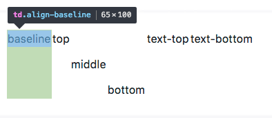
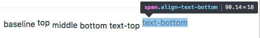
A set of utility classes that are equivelant to writing the css property vertical-align:middle;You can use this on inline and table cell elements. .align-(baseline, top, middle, bottom)
Utility
.align-content-*
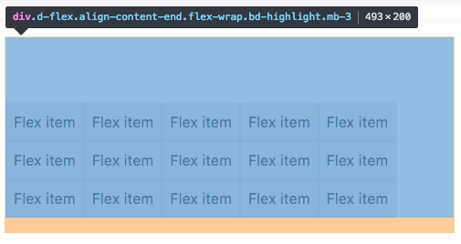
Added to the parent flexbox container to determing how the elements are aligned horizontally. .align-content-(start (browser default), end, center, between, around, or stretch)
Utility
.align-items-*
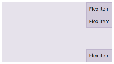
Class added to flexbox child items to specify if it should align towards the top or bottom of the container (start, end)
Utility
.align-self-*
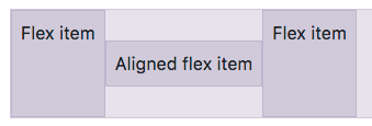
Used on flexbox items to align them vertically in relation to the parent container. If columns are used the items will align verticall. (start, end, center, baseline, or stretch (browser default)
Utility
.align-text-*
A set of utility classes that are equivelant to writing the css property vertical-align:text-bottom; You can use this on inline and table cell elements. .align-text-(top, bottom)
Utility
.badge-*

Used for labels and counters in applications .badge-(light, dark primary, secondary, transparent, white, warning, success, info, danger)
Badge
.bg-*
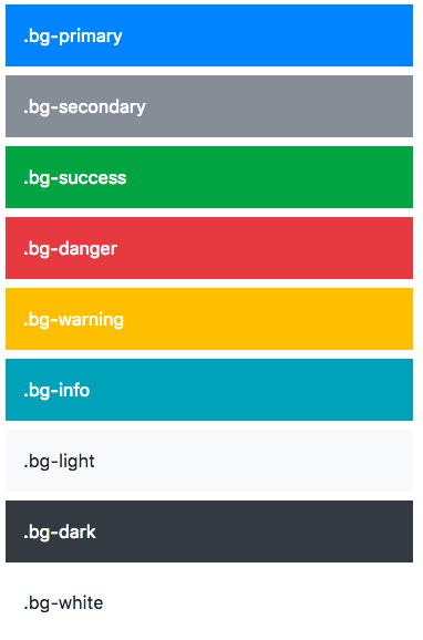
Background color utility classes: .bg-(light, dark primary, secondary, transparent, white, warning, success, info, danger)
Utilities
.border-*
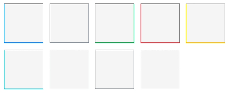
A versatile border utility class that lets you add/remove borders on a side or change a border color. .border-(light, dark primary, secondary, transparent, white, warning, success, info, danger, 0, top-0, right-0, bottom-0, left-0, top, right, bottom, left)
Utility
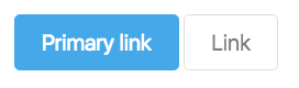
.btn-outline-*
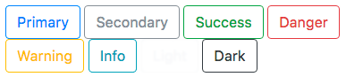
A button variation to have outlined buttons instead of a solid background. .btn-outline-(light, dark primary, secondary, transparent, white, warning, success, info, danger)
Buttons
.carousel-control-*
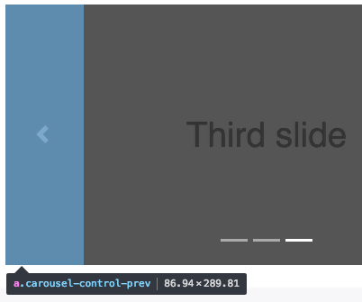
When you have an image carousel with pagination you will use this class on the previous and next anchor links. .carousel-control-(prev, next)
Carousel
.carousel-fade
n/a
Animates the slide transition with a crossfade instead of a slide
Utility
.col
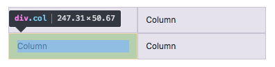
Flexbox items are automatically equal width so this class is used when you want your columns to be equal width and then go 100% on the xs breakpoint.
Grid
.col-*
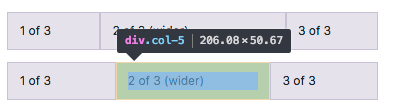
This class is used for grid columns to determin the column width and the breakpoint you would like it to be active. The classes work from the breakpoint you set and everything larger. .col-(sm, md, lg, xl)-(1-12)
Grid
.custom-range

Changes the default styling of a form input range
Forms
.d-flex
n/a
Sets the element to have have the style property display:flex;
Utility
.d-none
n/a
Sets the element to have have the style property display:none;
Utility
.d-*-*
n/a
A responsive display utility class that lets you specify when a display property is applied to the element. .d-(sm, md, lg, xl)-(none, inline, inline-block, block, table, table-cell, table-row, flex, inline-flex )
Utility
.d-print-*
n/a
Changes the display of elements when you print the document. .d-print-(flex, inline-flex, table, table-cell, table-row)
Utility
.fixed-*
n/a
This class makes an element fixed to the top/bottom of the browser window. Here is what the CSS ruleset looks like. .fixed-bottom {position: fixed;right: 0;bottom: 0;left: 0;z-index: 1030;}
Utility
.flex-*-*-*
n/a
Change the flexbox items layout, alignment, or size. .flex-(sm, md, lg, xl)-(row, row-reverse, column)
Utility
.flex-fill-*
n/a
Add to all sibling elements you would like to force into equal widths and fill all available horizontal space. .flex-fill-(sm, md, lg, xl)
Utility
.flex-(grow|shrink)-*
n/a
Forces an element to grow or shrink to use more or less of the space available .flex-(grow, shrink)-(0, 1)
Utility
.float-*-*
n/a
Responsive utility to float an element. .float-(sm, md, lg, xl)-(none, left, right)
Utility
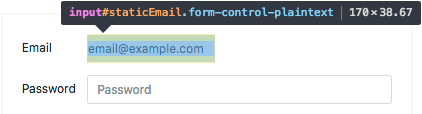
.form-control-plaintext

Use the .form-control-plaintext class to remove the default form field styling and preserve the correct margin and padding.
Forms
.form-row
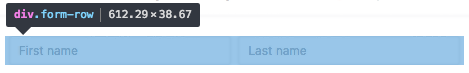
Works similar to a grid .row but is more compact to make the form look more uniform
Forms
.h-*
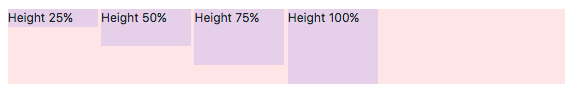
Height utility class that makes the element a percentage height of its parent element. h-(25,50,78,100, auto)
Utility
.invalid-feedback
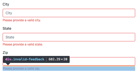
This class can be added with server side form validation to add a feedback message to an invalid field
Forms
.is-*
n/a
If you do server side form validation you can use this class to set feedback colors on inputs or error message. .is-(valid, invalid)
Forms
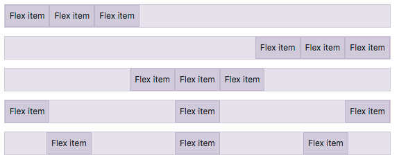
.justify-content-*-*
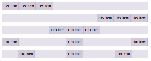
Class specifies where the flex items will be positioned inside the container. .justify-content-(sm, md, lg, xl)-(start, end, center, between, around)
Utility
.m*-*-*
n/a
Applies margin to an element using responsive breakpoints {property}{sides}-{breakpoint}-{size}
m(t,b,r,l,x,y)-(sm, md, lg, xl)-(0, 1, 2, 3, 4, 5)
Utility
.p*-*-*
n/a
Applies padding to an element using responsive breakpoints {property}{sides}-{breakpoint}-{size}
p(t,b,r,l,x,y)-(sm, md, lg, xl)-(0, 1, 2, 3, 4, 5)
Utility
.progress-bar-animated

When this class is added to a progressbar the progress will be animated using css3 animations
Progress
.nav-fill
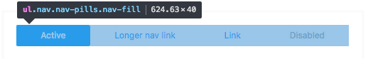
Makes all nav items use all available horizontal space. Nav items are different widths baded on their content.
Navs
.nav-justified
Makes all nav items equal width and use all available horizontal space.
Navs
.navbar-collapse
n/a
The nav links that are collapsed and shown when toggled on mobile widths.
Navbar
.navbar-expand-*
n/a
Since the navbar is displayed collapse on mobile first, this class specifies what breakpoint you want the navbar to not be collapsed
Navbar
.navbar-text
n/a
Vertically centers text inside a navbar
Navbar
.navbar-toggler-icon

The cheeseburger navigation icon is set using an svg background image of three horizontal lines
Navbar
.no-gutters
n/a
Removes the negative margin on the .row and padding from the child columns. Helpful when you want an image to expand to the edges of the browser without padding on the left and right edges.
Grid
.order-*-*
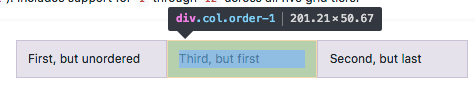
This class is used to control how the elements are ordered on the page regardless of their order in the source code. So you can rearrange your layout as needed.
Grid
.rounded-*
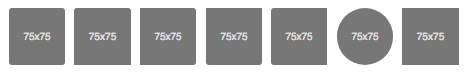
The .img-rounded class was renamed to this and is primarily used with images. However, the class just adds a border radius so you could use this on other elements that you would like a radius applied. You can also add .rounded-sm or .rounded-lg to increase the size of the radius.
Images
.visible
n/a
Hides the visibility of an element but does not change their display property.
Utility
.w-*
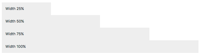
Width utility class that makes the element a percentage width of its parent element. w-(25,50,78,100, auto)
Utility
.was-validated
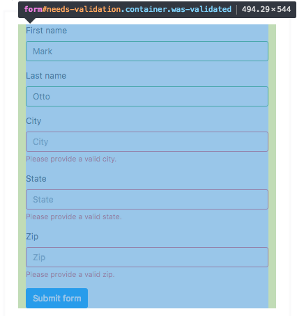
This class is set by Bootstrap's javascript to apply sub class validation styles to the form inputs.
Forms
.alert-heading
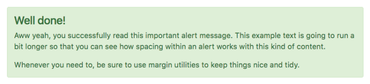
This class is added to headings inside alerts. It applies color:inherit so the colors match.
Alerts
.blockquote

Add to blockquote elements to apply the proper spacing and bottom margin to seperate it from other text.
Blockquotes
.blockquote-footer
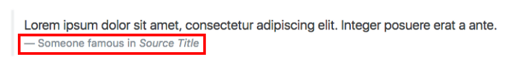
Wrapping class for citation text underneath a blockquote. Used to lighten the text color.
Blockquotes
.btn-group-lg
Increases the default button group size
Button Group
.btn-group-sm

Decreases the default button group size
Button Group
.btn-group-toggle

This class replaces an input checkbox with a custom style that is toggable on click
Button Group
.btn-lg
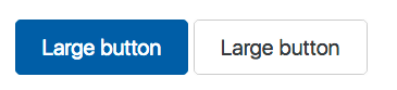
Increases the default button size
Buttons
.btn-outline-*
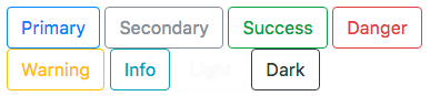
Transparent background with colored text and border (danger|info|primary|secondary|success|warning)
Buttons
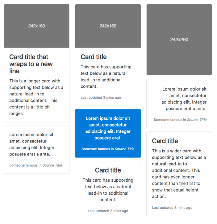
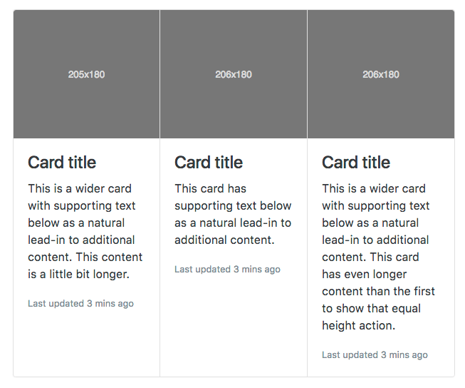
.card
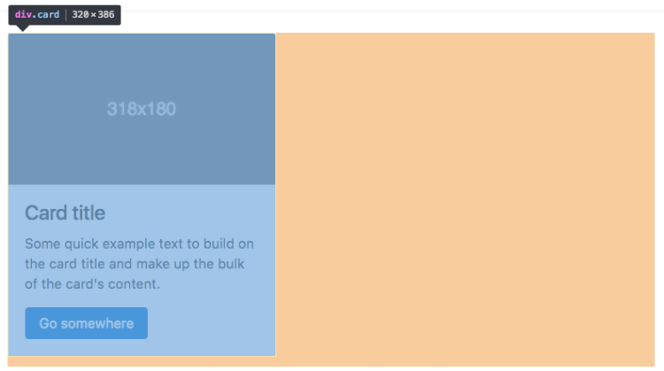
The class added to the div that wraps each individual card
Cards
.card-body
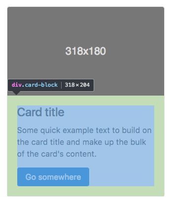
This class is added to the first child div inside the div.card parent
Cards
.card-columns
The .card-columns class is added to the wrapping div of of masonry-like collection of cards
Cards
.card-*
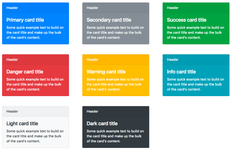
First add .card-inverse and then add one of the contextual background colors (danger|info|primary|secondary|success|warning)
Cards
.card-deck
Similar to columns Bootstrap card decks are equal height and width
Cards
.card-footer
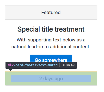
Wrap class for a card footer content area
Cards
.card-group
The parent wrapping class around a group of cards. Groups are similar to decks but they have no margin between each card.
Cards
.card-header
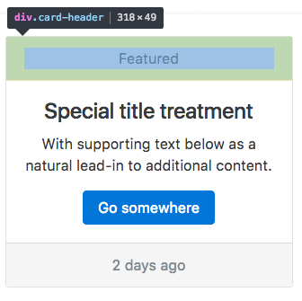
Wrap class for a card header content area
Cards
.card-header-pills
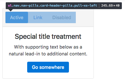
Class added in combination with .nav-pills to add pill navigation to a card header
Cards
.card-header-tabs
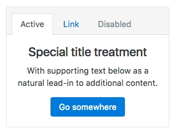
Class added in combination with .nav-pills to add tab navigation to a card header
Cards
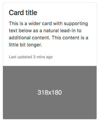
.card-img

Add this class to the image you would like to have as a card background image. Used with creating cards with image overlays.
Cards
.card-img-bottom
Similar to a card footer you can cap the bottom of a card with an image
Cards
.card-img-overlay
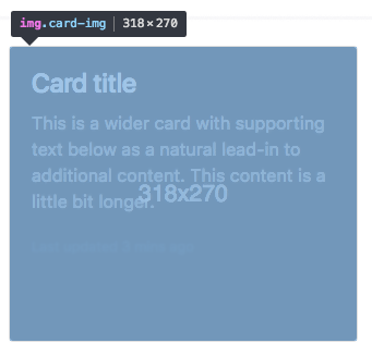
Wrapper class used to create a card that has a background image overlay
Cards
.card-img-top
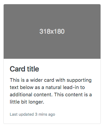
Similar to a card header you can cap the top of a card with an image
Cards
.card-inverse
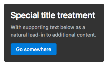
Inverts the default colors to use light text on a dark background color
Cards
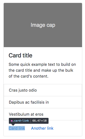
.card-link
Adds spacing around links added inside cards
Cards
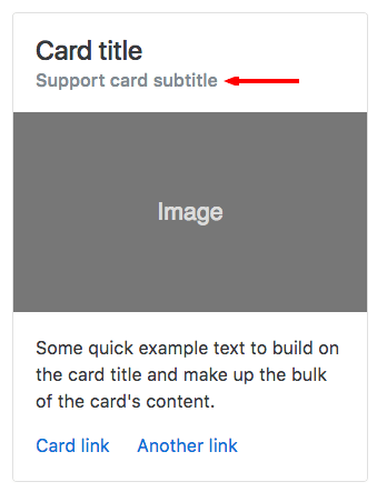
.card-subtitle
Class added to card subtitles that adjusts the default heading styles
Cards
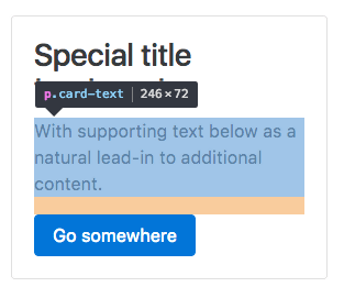
.card-text
This class wraps the container around card text
Cards
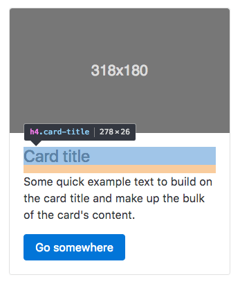
.card-title
The class added to titles inside cards. It applies the proper spacing.
Cards
.carousel-item
The wrapper class applied to each individual carousel item
Carousel
.clearfix
n/a
Clears the floats of any child elements. Add this class to the parent element wrapping the floating elements.
Utility
.col-form-label
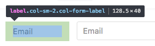
Class added to form labels to apply consistent padding and margins
Forms
.col-form-label-lg
Increases the font size and spacing of a form label
Forms
.col-form-label-sm
Decreases the font size and spacing of a form label
Forms
.col-xl-*
n/a
Set column width for anything greater than 1200px. Specify the column span by adding 1-12 at the end
Grid system
.custom-checkbox
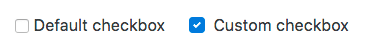
Parent class that converts a default form checkbox into a custom HTML/CSS checkbox
Forms
.custom-control
n/a
Used on all custom form inputs and adds base styles like padding and display:inline
Forms
.custom-control-inline

Custom form checkboxes are set to be display:block. Use this class to make the checkbox inline
Forms
.custom-control-input
n/a
This class is added to the default input that is going to be replaced. It adds the following: position: absolute; z-index: -1; opacity: 0;
Forms
.custom-control-label
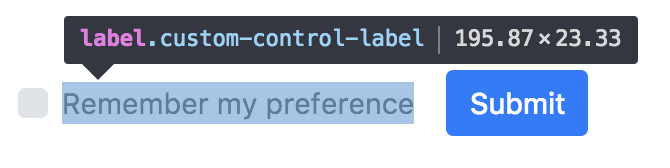
When creating a custom form checkbox, this class replaces the default checkbox with custom elements using :before and :after
Forms
.custom-file
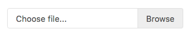
Class added to a label of grouped elements to create a custom file upload input
Forms
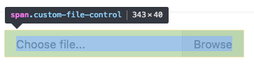
.custom-file-control

Similar to the custom-control-indicator class this class is added to a div to build a custom file input using CSS :before and :after.
Forms
.custom-file-input
n/a
This class is added to the default input type="file" and hides it using CSS
Forms
.custom-file-label
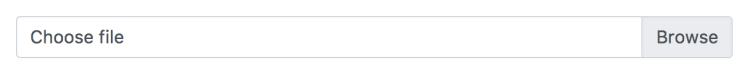
When creating a custom form file browser, this class replaces the default file browser with custom elements using :after
Forms
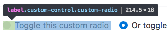
.custom-radio
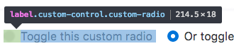
This class is added to the parent label tag along with .custom-control class to specify what kind of custom input it will be
Forms
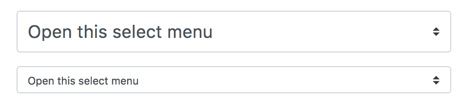
.custom-select
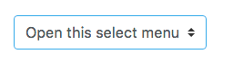
Class added to a select tag to create a custom select menu
Forms
.custom-select-sm
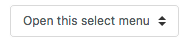
Decreases the font size and padding on a custom select
Forms
.custom-select-lg
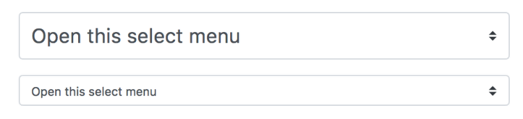
Increases the relative size of a custom form select
Forms
.custom-switch
Creates a custom form element that looks like a toggle switch found on touch devices.
Forms
.d-*
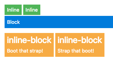
Append the following to change the element display property (block, inline, inline-block)
Utility
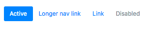
.disabled

Add this class to anchor tags to disable the click functionality but still have them visible.
Buttons
.display-*

Bootstrap v4.3.0 Class Listesi
|


